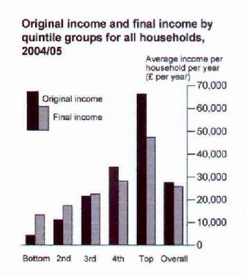
This is a graph from the UK, released by National Statistics yesterday, where income inequality is falling.

It illustrates well how incomes are flattened by the tax and benefit system. I'd like to see an equivalent one for NZ, especially since the introduction of Working For Families. Note the final columns and the gap between them. That's the financial cost of state redistribution. The social costs are another matter......

3 comments:
Interesting that 60% of UK households get more back in benefits than they pay out in tax.
Any wonder why moderate to radical socialism is supported by 60% of Brits?
Your are Excellent. And so is your site! Keep up the good work. Bookmarked.
»
I'm impressed with your site, very nice graphics!
»
Post a Comment