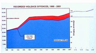
Not the best graph but it illustrates well the Labour spin.
Left side shows total violent crimes (from zero to 50,000)
Right side shows offences per 10,000 population (from zero to 140)
The lower line has flattened. Violent crime is steady.
The top line continues to grow. Violent crime is up.

No comments:
Post a Comment